Healthy Eating Plate

Most of us have tried to learn about healthy eating habits from the Food Guide Pyramid. This graphic attempted to explain how much we should eat of the four basic food groups, plus fats and oils, by placing them in wider or thinner parts of the pyramid. The bottom of the pyramid represented grains and cereals, of which the recommended daily serving was 6-11 servings. But there was much confusion around this approach.
How much do you know about serving size?
Here's a little test: close your eyes and try to picture six servings of grains and cereals. Do you see a heaping bowl of pasta? A stack of French toast? A handful of crackers?
If you're clueless about serving size, you're in good company. The USDA found that most people weren't sure how many slices of bread or cups of pasta added up to the daily allotment, or how many cups of fruit juice equaled a serving of fruit. The confusion about portion size led people to either overeat or grow frustrated and abandon the food pyramid approach altogether. (FYI, a slice of bread is worth one serving, as is a half-cup of cooked rice or pasta; a serving of fruit is ¾ cup of juice).
A simpler way of eating
The USDA created a graphic that simplifies the pyramid into a new image: a plate. MyPlate serves a function that the old pyramid didn't, which is to illustrate actual portion sizes. The plate is divided into slightly unequal quadrants, representing the familiar four food groups, with a heavy emphasis on fruits and vegetables. (Notice there's not a spot on the plate for a bag of chips or a sugar-loaded Twinkie.)
The ChooseMyPlate site also offers daily tips for healthy eating, recipes, and a personalized diet plan based on your age, size, and exercise regimen.
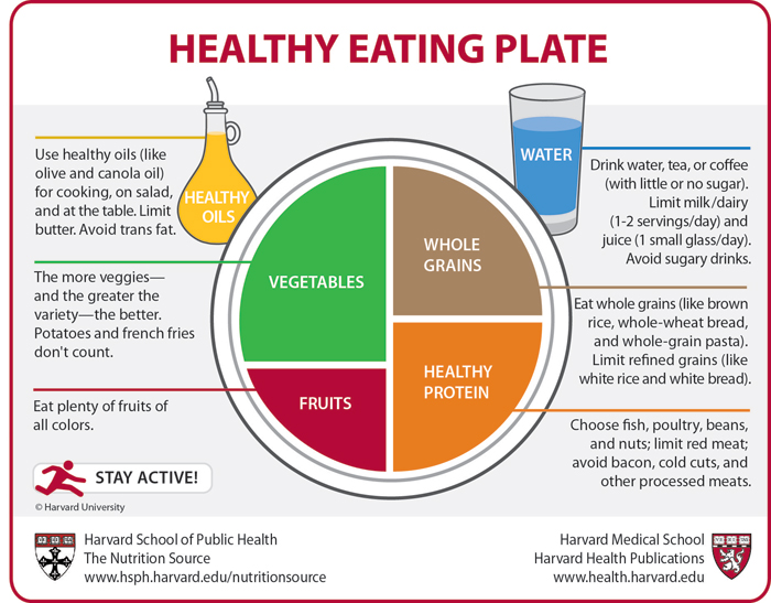
Harvard Takes the Plate One Step Further
Researchers at Harvard School of Public Health recently improved upon the MyPlate graphic by addressing specific portion and food selection issues that the USDA's graphic doesn't mention. For example, Harvard's Healthy Eating Plate encourages consumers to choose whole grains over refined grains and fish over red meat, while MyPlate doesn't make these distinctions. The Healthy Eating Plate also emphasizes the need to have a variety of vegetables and fruits and to avoid sugary drinks.
Harvard School of Public Health emphasizes the importance of introducing a more specific graphic for consumers on its website: "A hamburger or hot dog on a white bread bun with French fries and a milk shake could be part of a MyPlate meal--even though high red and processed meat intakes increase the risk of heart disease, diabetes, and colon cancer, and high intakes of refined grains and potatoes make it hard to control weight." While the USDA focuses on portion control, Healthy Eating Plate goes one step further, providing consumers with specific advice on the kinds of foods to eat (and which ones to avoid).
You can examine a comparison chart of the graphics yourself at the Healthy Eating Plate site.
References:
http://www.hsph.harvard.edu/nutritionsource/healthy-eating-plate/